Designers have been eagerly waiting for the big announcement of Pantone’s Color of the Year.
Designers know Pantone as the organization that creates and curates the Pantone Matching System (PMS) which maintains a universal system for colors. PMS is the staple color system for the print and design industry.
Recently Pantone announced its Color of the Year which designers closely follow so they can be sure their work is ‘on trend.’
Here it winner: Living Coral.

Here is some rationale:
“An animating and life-affirming coral hue with a golden undertone that energizes and enlivens with a softer edge,” says the company on its website.
As much as a color can be humanized, that’s what Pantone was aiming for, noting that the choice is “in reaction to the onslaught of digital technology and social media increasingly embedding into daily life.” In addition, “(We) are seeking authentic and immersive experiences that enable connection and intimacy.”
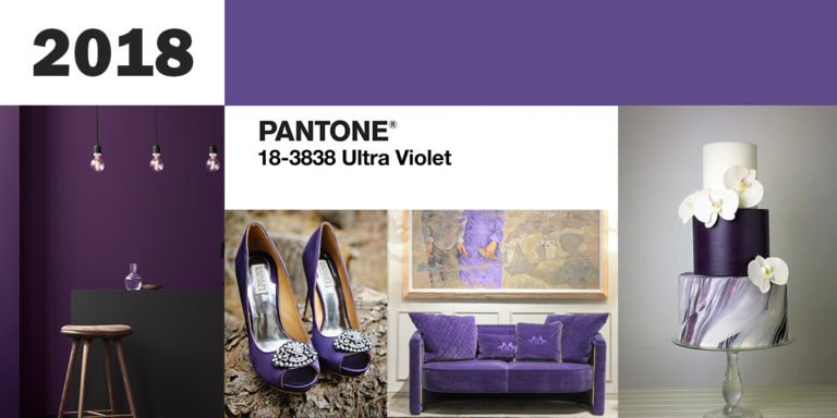
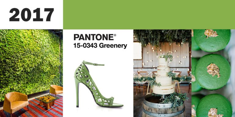
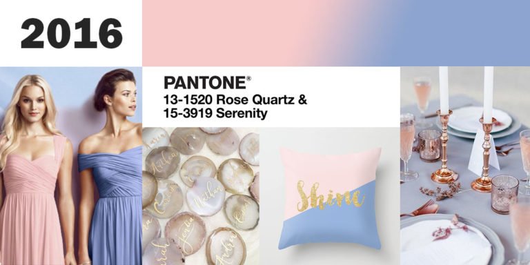
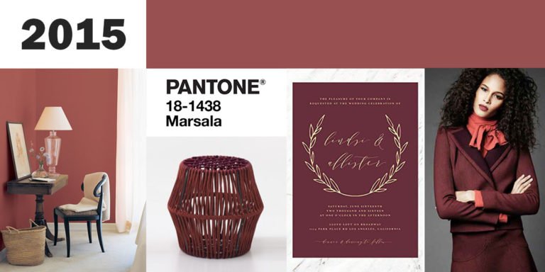
Recent Winners
We thought it would be fun to look back at the winners in recent years.


