By Nicholas Pearson, Published by Domtar Paper
Part of our mission here is to showcase and inspire incredible works of print marketing. We love to see what others have created on our paper and one of our favorite assets is our Domtar Paper Gallery. With hundreds of pieces dating back nearly a decade, the Gallery is a place where creatives can sit back, click through and discover inspirational print marketing ranging from unique Christmas projects to captivating festival posters. Here are the most popular Domtar Paper Gallery Submissions for 2020.
Kate Spade is a legendary fashion designer and businesswoman who founded the famous Kate Spade brand. Colorful, groundbreaking and fun, our love for the Kate Spade brand is only outweighed by our love for the Kate Spade Brand Book which proves without a doubt that uncoated paper can reproduce vivid color beautifully.
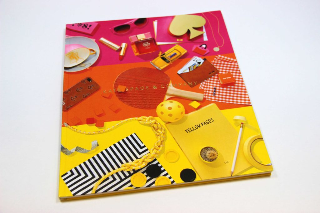
This lovely printed piece takes the much-loved branding and products created by Kate Spade New York and presents them in a tangible way that can only be described as a visual treat. Designed by Sydney Applegate Lang with print production management by Stephanie Friese, the pages within are Cougar® 130 lb. Cover and 65 lb. Text.
Our second feature on this list is the #4 issue of Eye on Design by AIGA, American Institute of Graphic Arts. A tri-annual publication, Eye on Design explores the connections between graphic design and the wider world and each issue is carefully curated by the editorial staff and designed by a guest designer. This issue in particular was designed by David Benski, based out of Berlin.
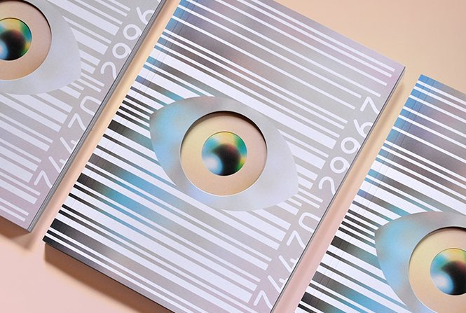
Full of bright, colorful and loud images, it only takes one look to know that Benski delivered a masterpiece. The vivid color pops off the page with flawless solids and excellent detail reproduction. Printed on Cougar® 80 lb. Text, Super Smooth Finish for the interior pages and Cougar 100 lb. Cover for the outside of the magazine. This is a must-have in the world of design and for book collectors.
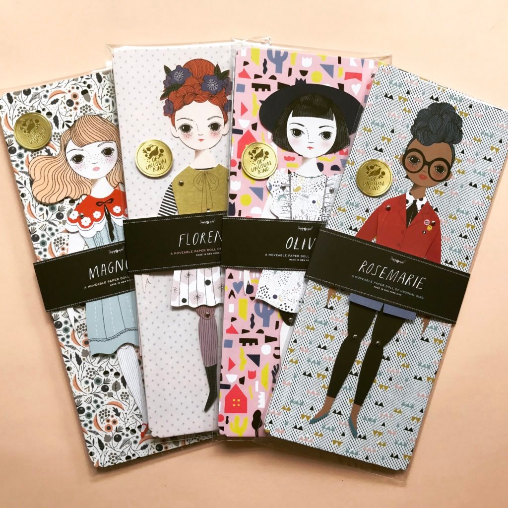
One of the most unique submissions in the Domtar Paper Gallery is the Paper Dolls of Unusual Kind. Refined, playful and fun, this eclectic collection of hand-illustrated paper doll cutouts inspires imaginative play and out-of-the-box ideas. If you haven’t spotted these handcrafted beauties at an art museum gift shop or your favorite gift boutique, you may have heard about them through the awards circuit—they grabbed a Parents’ Choice Gold Award and won first place for packaging in the toy category in the 2017 Dieline Awards.
Each year the Canadian Association of Tire Recycling Agencies holds its Annual General Meeting (AGM) in a different location in Canada. In 2019, the AGM was held in Victoria and Print Solutions Provider took a group photo as a souvenir of the event. Wanting to present it in a simple folder, they tasked Shortcreative, a graphic design company based in Victoria, BC, with taking a creative approach to the folder. Randy Wachtin, of Print Solutions Provider, says that “[Shortcreative] played on the concept of business travel and the result was a unique folder simulating a leather briefcase. On the back is a ‘travel sticker’ to represent the city in which the meeting was held. Soft-touch laminate creates a leather-like feel and a hand-applied magnetic closure completes the effect.”
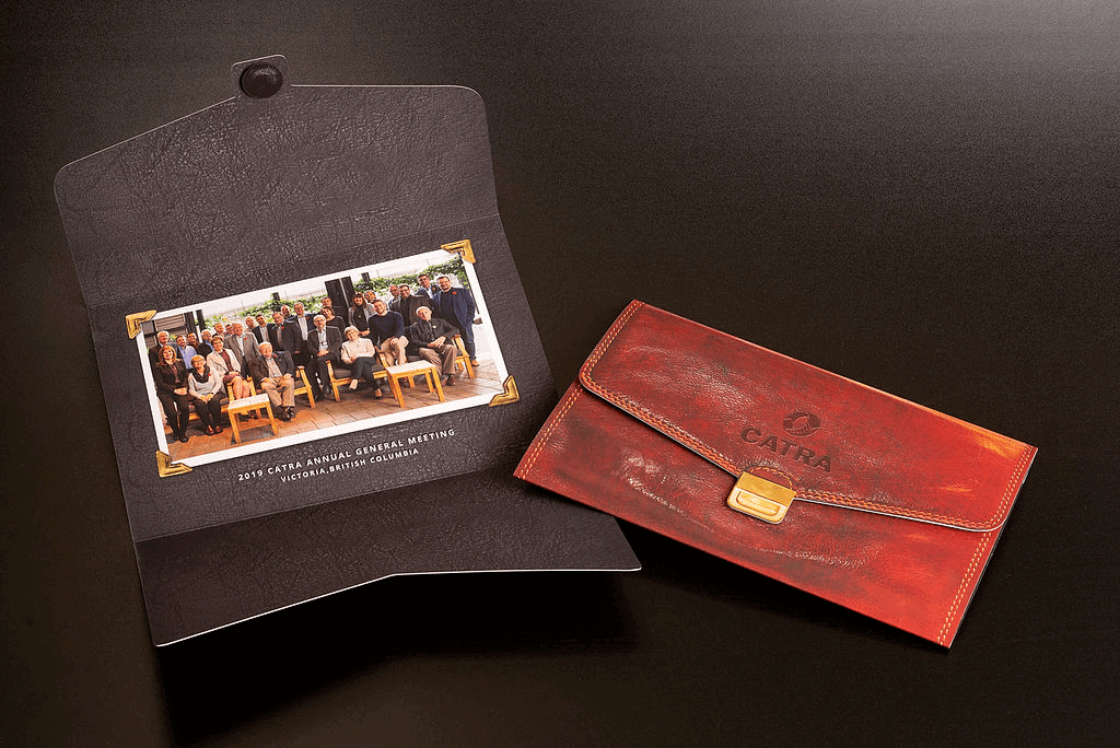
The result is an incredible folder that looks like a leather wallet at first glance and showcases the versatility of uncoated paper.
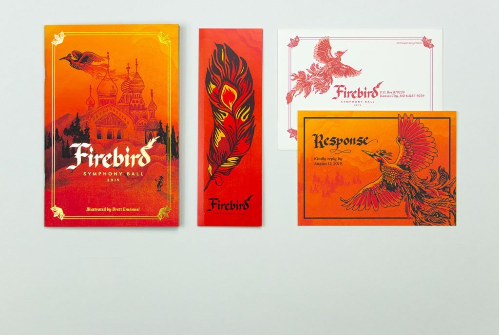
Our fifth entry on the list is one of my personal favorites. Created for the Symphony Ball 2019: The Firebird Ball, hosted by the Symphony League of Kansas City, these beautifully done invitations ask you to step into a Russian fairytale and take a journey through an enchanted forest. Everything about this piece promises an elegant evening full of laughter and warm memories and the captivating Firebird that graces both the invitation and illustrations is stunning and bold.
If you have doubts about choosing digital printing for a high-end printed piece, the Waterworks Food Hall booklet will blow them away. Elegant and sophisticated, the printed results of the iGen5 on Cougar Cover expertly and accurately convey the vibrant lifestyle present in one of Toronto’s most exciting urban neighborhoods. The bold colors and scrumptious photographic elements—from warm woodgrain and skin tones to industrial textures—combine with the refined design aesthetic, resulting in an energetic result that pops off the page.

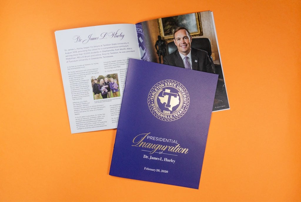
With its main campus in Stephenville, an hour southwest of Fort Worth, Tarleton State University offers the value of a Texas A&M University System degree with its own brand of personal attention, individual opportunities, history, tradition and community. When they needed a partner in creating this incredible piece to honor the Presidential inauguration of Dr. James L. Hurley, they turned to Domtar Paper. The result is the beautiful brochure you see here.
Andy Goldsworthy is a British sculptor, responsible for creating the Walking Wall at The Nelson-Atkins Museum of Art. The project fulfills his long-held vision to build a stone wall that moves across the landscape. The Walking Wall is a continuous entity, moving and changing as it winds its way towards the Nelson Atkins. It has neither a true beginning nor an end. Instead, its form depends on your perspective.
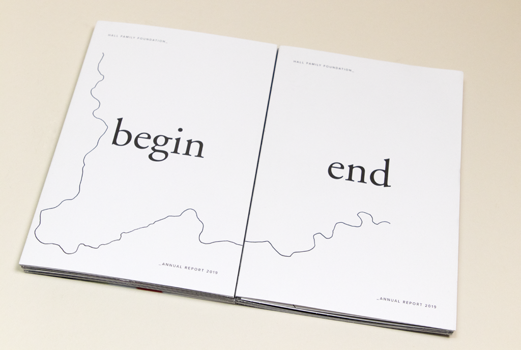
The Hall Family’s contributions to Kansas City’s communities were no different, shifting and changing throughout the life of the Foundation. This concept channels that, capitalizing on form and language to show duality. The physical form of the report acts as a metaphor to reflect the way the Walking Wall moves along a path through the grounds of the Nelson, and we’re proud to feature it in our paper gallery.
It’s always exciting to receive beautifully designed pieces on our paper, but to receive a printed piece with a message and a mission is particularly thrilling. For: Magazine is a publication that was created by Ultravirgo, a Brooklyn-based agency specializing in strategic communications for international NGOs and national non-profits. With a goal of telling global stories of people who improve the world for others, the first issue – Maturing – features individuals who make the world a better place while challenging preconceived notions of “growing up” and “growing old.”
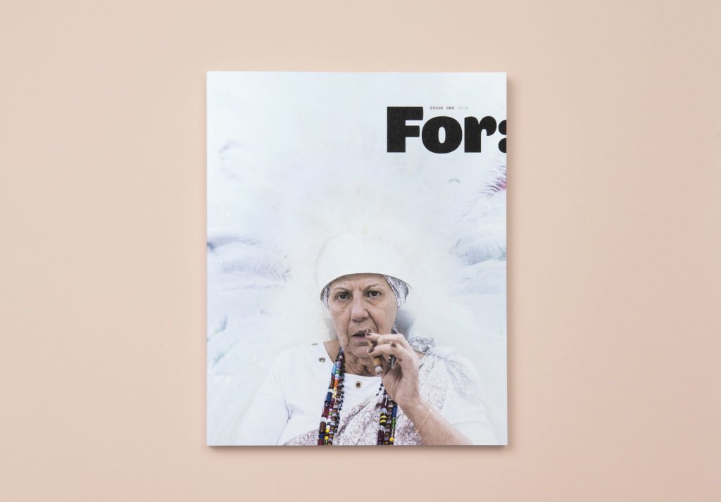
The uncoated nature of Lynx paper, combined with smart design and compelling stories, adds to the authentic nature of the magazine while the flawless detail, skin tone and color reproduction enhances the overall experience.
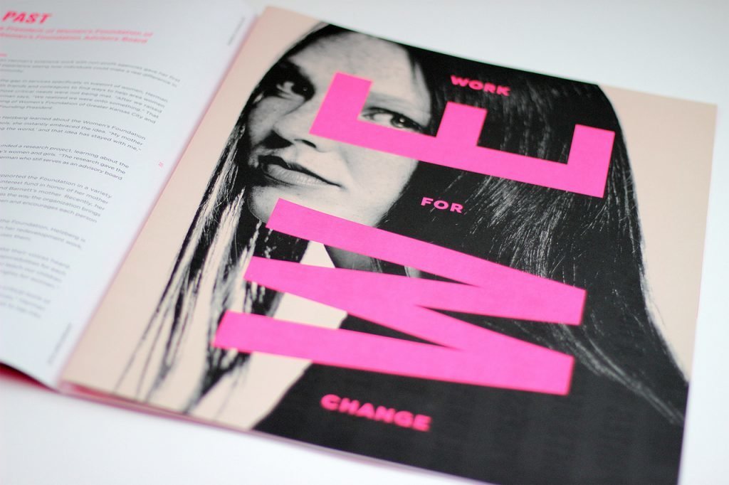
Last and certainly not least is a piece that makes us say…WOW! This Best of Ink award winner is a flawlessly printed piece on Husky® Opaque Offset. Creative typography and exceptional print quality make this piece a vision, and the deep black and bright fluorescent inks create an intensity that draws attention to the seriousness of the message. From the heavy ink coverage and limited color palette (PMS 806, PMS 7520 & Black), to the sophisticated design and oversized tabloid layout, all elements work together to create a bold, striking statement and provide the exclamation point for our top #10.
Pubished by Domtar Paper